Marginal Notes on Medium
John Clements has written eloquently on the recent change to marginal notes, linked as a response to Ev Williams’s original piece about Why Medium Notes are different and how to use them well from April 2013. This piece is prompted by that one; you might like to read it first.
Before Medium 2.0, I found Medium Notes a very useful means of providing explanatory detail. For example: I wrote a handful of pieces about EU copyright reform and its potential threat to street photography earlier this year, very helpfully syndicated by Pete Brook’s Vantage.

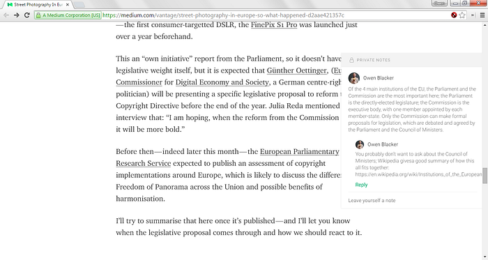
In order to make these pieces more easily understandable for anyone who isn’t an EU-politics junkie (guilty as charged), I used marginal notes to link to explanations on how to read the graphics and annotated voting reports and on how the different EU institutions are important. But these notes have become private, visible only to me.
Adding content like this into the main copy interrupts the flow of the text — it’s quite difficult to work dense explanations into gripping prose. Marginal notes can be an elegant solution to this problem — Dave Liepmann’s Tufte CSS does this well and links to a Chris Rock interview on Vulture that does so beautifully (hover over the red-underlined text); Butterick’s Practical Typography also does this nicely and Liepmann links to a piece on Grantland that uses marginalia to provide rich metadata on familial connections in Brazilian jiu-jitsu. You can see how elegantly this works in these screenshots:


I understand that one of the reasons for removing the marginal notes from Medium might be related to presenting an elegant and usable solution to the majority of readers, who will be reading our words on smartphones and tablets — Marcin Wichary wrote about this in Of screens big and small, published with the Medium Update — though it’s worth noting that Tufte CSS includes code to toggle the display of these notes and Medium 1.0’s mobile-web UI handled notes elegantly.
I am very much an admirer of Medium’s design team, particularly in regard to their use of typography. I often describe Medium as a service that “makes it easy to produce beautiful writing, with a simple and elegant editing interface” and as someone with a geeky interest in typography and whose day-job involves creating web applications, I think it’s one of most elegant websites I’ve seen.
I do hope the team will give some consideration to how we might present metadata — be it as marginal notes or otherwise — in a future update to their gorgeous website.
Screenshots are all taken by me, in Google Chrome on Microsoft Windows. While they are all derivatives of the respective websites and, thus, subject to the copyright of the websites in question, they are used without permission, ostensibly for the purpose of criticism and review under section 30(1) of the Copyright, Designs and Patents Act 1988; it is the author’s belief that this constitutes fair use by way of criticism and comment in the meanings of 17 USC §107.
This article is dedicated to the public domain under the terms of the Creative Commons Zero licence. Please translate, copy, excerpt, share, disseminate and otherwise spread it far and wide. You don’t need to ask me, you don’t need to tell me. Just do it!
